Introduction
This post is going to be in two parts. In the first part, I’ll outline some of the things I think about with regards to the way computers are designed, especially in terms of Apple’s vision of frictionlessness. In the second part, I’ll delve into what makes the company Anthropic a brilliant company — not because their product is particularly special or wonderful (I think it’s quite flawed), but because their marketing is incredible.
I want to lay this all out because I think the big secret of AI lies not in the software but in the marketing, and I think Anthropic is a rich example of how these companies rely on pre-existing assumptions and expectations in order to convince us AI is the future.
- Deus in machina?
- Advertising destruction
- GUIs and Portals
- The Apple (Store) aesthetic
- To seem and not to be
- The illusion of transparency
- Frictionlessness forever
Deus in machina?
Anthropic recently announced that their latest model — the grandly-named “Claude Mythos” — is too powerful and dangerous to release to the public yet. I think there’s good reason to doubt this claim, but we won’t be able to tell for sure until (if) it is eventually released to the public.
 Anthropic CEO Dario Amodei (source)
What I can say is that this gloom-and-doom, anxiety-inducing rhetoric is a classic AI company PR move. Companies like Anthropic and OpenAI have long deployed fearmongering towards the ends of marketing to an extent I, at least, found kind of puzzling at first. Why would a company training LLMs claim that the LLMs they’re training could destroy the world? Isn’t destroying the world…bad?
One of the things this intuition fails to take into account is just how arrogant the leaders are at these corporations. Yeah, AI might (according to them) become superintelligent and destroy the world — but we and we alone are brilliant, virtuous, ethically-attuned, handsome, etc. enough to create the big-brain robot while also ensuring it doesn’t destroy the world. Add a dash of Cold War-style nationalism – heaven forbid Communist China make The Ultimate Chatbot before we do — and suddenly it starts to make more sense why Anthropic would want to announce that their computer program is massively destructive. (For what it's worth, it really doesn't seem to be particularly special; more on that next time.)
I’m putting it cynically here, but I think one of the interesting things about Anthropic is that they genuinely do seem to believe their own hype. While Gideon Lewis-Kraus’s New Yorker article on Anthropic is presented as a reasonable investigation into the Claude chatbot’s potential sentience, it is, in fact, much more compelling as a portrait of collective, contagious delusion. Working at Anthropic seems to entail — and I don’t think this is actually an exaggeration — the earnest belief that you are engaging in the project of creating a godlike being.
Advertising destruction
Of course, nothing in the technology itself seems to imply that the deific is on the horizon. It doesn’t even seem to imply that effective replacements for workers are on the horizon. AI is intrinsically glitchy and error-prone; it doesn’t seem to improve productivity; etc. Many of the more dramatic claims made for its capacity to “escape containment” convieniently elide the fact that the chatbots in question have already been given access to all of the important files in a given computer system. Besides, what it does with those files is both unpredictable and counterproductive — a lesson learned in spectacular fashion by Meta’s “head of superintelligence” .)
Still, Anthropic thinks they’ve really done it – and a lot of other people think they have, too. While I think the claims they make are impressive in their way (if they are indeed true), I really do think a lot of their recent success comes down to good old-fashioned marketing.
For one thing, Anthropic wisely made the tactical decision to focus on coding and enterprise software – two sectors with a lot of pre-existing AI buy-in. But they’re also very good at framing and aestheticizing their product. While I’m no graphic design expert or user interface (UI) designer, I do think it’s important to engage critically with these aspects of the technology — and I think AI hype is frankly inseparable from the design of commercial LLM interfaces — so I’m going to lay out some context for the way I think about this stuff, as well as some provisional thoughts about the way Anthropic presents itself and its products.
GUIs and Portals
At first, computers were very hard to use. (This account I’m about to give is indebted to the work of Cory Doctorow, especially Enshittification. It’s also highly reductive — though that’s on my end, not his.) Even after they started to spread beyond universities and government labs, they were still way too abstract for less technical users.
One of the big hurdles was that you had to maneuver in the command-line, using only text; this process entailed memorizing a bunch of commands that didn’t necessarily correspond with pre-existing intuitions.
 Words, words, words (plus some numbers) (source)
This changed with the introduction of the graphical user interface, or GUI (usually pronounced, hilariously, “gooey”). A GUI represents the computer’s processes and structures as images — icons, folders, menus, etc. Components of any given GUI are often skeuomorphic, or designed with reference to real-world counterparts. The idea of the “folder,” for example, is meant to draw to mind physical file folders; likewise, when you want to get rid of a file, you throw it in the “recycle bin” or “trash can,” which you have to “empty.”
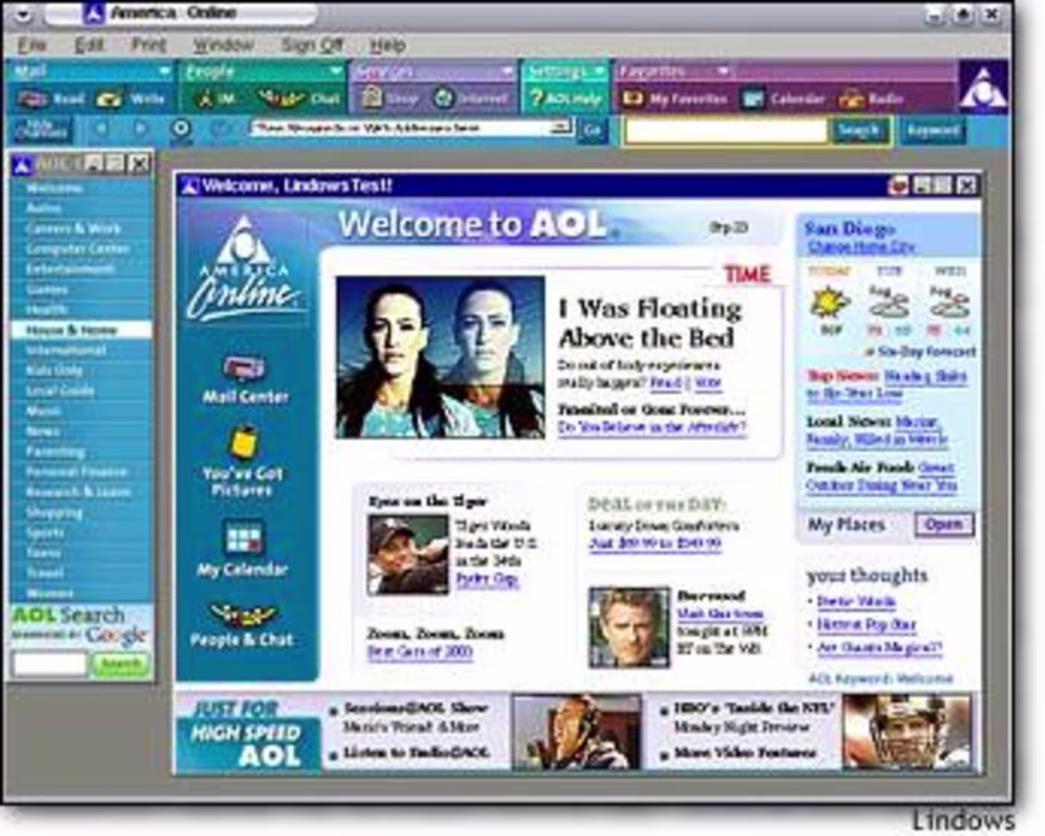
GUIs made the computer itself easier to use. But the internet remained opaque and difficult to navigate. This changed with the advent of web portals like AOL. By selecting and aggregating useful websites and services, web portals made the internet a lot more usable for people without backgrounds in technology.
This came, however, with a trade-off. Take the AOL example: while guideposts were essential for most people trying to navigate an unindexed, pre-Google internet, reliance on a web portal gave the people in charge of designing that portal a lot more power. Suddenly, platforms like AOL could steer the user towards whatever they wanted, with the knowledge that most of their users were reliant on the web portal for services rapidly becoming essential.
 You may not like it, but this is peak UI design (not really) (source)
The illusion of simplicity — because it was, in some sense, an illusion; the internet hadn’t gotten any less complicated — made it possible for corporations like America Online to make decisions about the user experience that users themselves wouldn’t even notice.
The Apple (Store) aesthetic
It seems hard, at least to my untutored sensibility, to dispute that Apple is the most influential design firm of the twenty-first century, at least in the realm of consumer-facing technology. For a brief window, their brand name was synonymous with the promise of user-friendliness. I regard the cult of Steve Jobs as fundamentally inane — at the end of the day, he was just as much of an abusive, Stanfordian robber baron as Bill Gates or Sam Altman — but his tenure did result in the invention and production of some remarkable consumer goods.
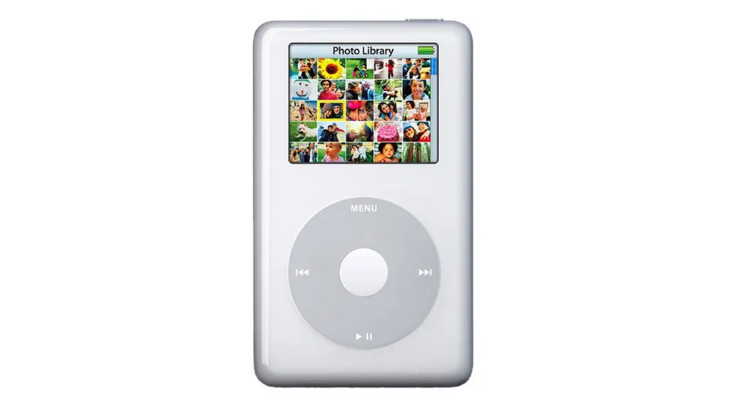
The iPhone correctly gets the most credit, but the iMac, like the Apple II in its time, did a ton to bring usability to personal computing. And — more to our point — their whole presentation as a brand conveyed this.
 Plenty of cool software?? Count me in (source)
When I was in high school, my friends and I lived relatively close to one Regular Mall and one Fancy Mall. The only thing that brought us to the Fancy Mall was the Apple Store. I remember vividly how cool and weird it looked — completely unlike any of the dim, mazey clothing stores surrounding it.
The Apple Store was one big brightly-lit room with, like, five tables inside, each of which had a few products on it, and it was always packed. The room looked like the products, which looked like the logo, which looked like the user interfaces. By the late 2000s they’d abandoned the quirky, brightly-colored aesthetic early iMacs, opting instead for an ostentatious, soft minimalism. (We sell both colors here: white and silver.)
 OK now this actually is peak design (source)
This was really smart and really persuasive. Apple products looked expensive, and they were; they also looked like they worked well, and they did. I don’t know what backroom decisions led to Apple’s dominance over the software used by what we now unfelicitously call “creatives,” but they played this association to their advantage — the MacBook user got to experience the frisson of acceptably ostentatious (“upper middle class”) spending with the authenticity of the artist.
(It helped that they really did have a pretty innovative suite of accessible creative software. GarageBand in particular stands out to me as a remarkable little computer program.)
But none of this would’ve worked if the computers didn’t work really well. The fact that Windows can be installed on basically any computer has always made it a bit of a pain: the constant threat of hardware that doesn’t quite match the software makes them prone to acting up. (Anyone familiar with the phrase “driver update” knows this well.)
Apple’s vertical integration — their control over both hardware engineering and operating system design — meant that, broadly speaking, they just worked. An Apple computer was a good tool for doing a new kind of work. And they looked the part.
To seem and not to be
But it’d be naive to think, as many did, that this clarity and dominance was simply a result of Having the Best Design. Behind the scenes, Apple was pioneering entirely new varieties of hostility to users, consolidating what various courts have contended (and continue to contend) monopolistic market dominance.
The most spectacular example, documented in Enshittification, is probably their flagrant abuse of copyright law. (Here is an earlier Doctorow post on the problem.)
Apple’s vertical consolidation includes, or attempts to include, repair services. (I myself exited the Apple computer ecosystem after having to pay $600 in 2013 to replace a dented charging port on my MacBook Pro.) Because they want to charge you a zillion dollars to repair your computer when you break it, it’s in their interest to forestall the circulation of used and refurbished computer parts.
One of the ways they do this is by etching an almost invisibly tiny Apple logo on every part they make, then claiming that, if one of those parts were refurbished poorly, the presence of the logo meant that failure would reflect poorly on the Apple brand — even though you basically need a magnifying glass to see the logo at all. This allows them to invoke copyright laws intended to prevent completely unrelated types of “brand damage.”
But we, the users, have no idea this is going on. We just know that to get your Apple stuff repaired, you should probably go to the Apple store.
This kind of naturalization — intentionally pulling the wool over consumers’ eyes through design decisions that seem inevitable — is all over modern computing. During Microsoft’s famous antitrust hearings in the 1990s, one of the main contentions was that they were pulling something similar with their proprietary internet browser, Internet Explorer. Internet Explorer was embedded so deeply in the Windows operating system that it was impossible to uninstall. Without it, you couldn’t browse files at all.
 Bill Gates being rude (source)
I remember recognizing this as a kid when I realized I could type a web URL into the file browser’s address bar — but I didn’t even think about it as a “decision” until I was reading about these trials decades later. But there’s nothing inevitable about it. There’s nothing keeping an operating system from having a separate web browser and file browser. All that this decision actually did was make it harder for users to escape Microsoft’s inferior proprietary web browser. See also: “Bing.”
I want to write about the way this manifests in modern design in another blog post, because this one is already running long, but suffice it to say: tech companies want us to use their, and only their, products. They want us to use them all day, mostly so that we look at more ads, because ads constitute the vast majority of the revenue at companies like Google and Meta. (80% and 98%, respectively!)
It is, of course, not remotely in our best interest to use their products all day, especially not when we are just using them to doomscroll or craft baroque parleys on DraftKings. All of this is to say: these corporations get us to do what we don’t want to by means of design decisions we aren’t meant to perceive as design decisions. The way they keep us from perceiving them is by concealing them under the guise of simplicity — of usability.
The illusion of transparency
This fake-out works for another reason: “transparency,” or at least comprehensible causality, is fundamental to good user interface design. A good user interface allows you to clearly connect your actions with events. When you push the button, something happens; a well-designed UI communicates to your intuition that pushing the button will do the thing you want it to. A good UI feels transparent. The “messages” button looks like the button you’d press to get to your messages, and when you press it, it takes you to your messages. It feels like using a much simpler tool. Pull the rope and the bucket comes up; push the lever and the trapdoor opens.
This transparency is, of course, a carefully-crafted illusion. And this illusion is based on a wide array of naturalized cultural constructions: it is only possible thanks to decades, if not centuries, of accumulated artifice.
For example, you associate the little chat bubble used in the “messages” icon with text because of comic books, which used them to represent speech spatially, as emerging from specific depicted bodies. The idea of the “button” itself is a post-industrial construction: digital buttons are skeumorphic representations of an electric mechanism invented in the 1880s, one which contemporary writers found surprisingly disturbing.
The actual mechanics of an iPhone’s operation, of course, aren’t nearly so clearly causal as a lever. A phone screen is a constantly-shifting input space, each of whose states correlate a set of coordinates on the screen with a big list of commands: make the phone vibrate a little bit, make the icon get a little bigger, communicate with the operating system to “switch windows” (themselves figurative representations of abstract digital space), etc. — an enormous complex of conditional statements summoning from binary numbers a vast complex of associated representations.
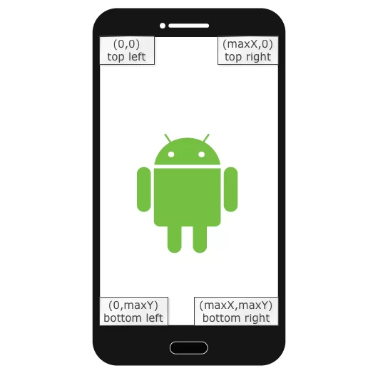 An Android phone, coordinated (source)
Frictionlessness forever
Most people don’t quite realize this, or don’t think about it in these terms. One group of people who do realize this are software engineers — that is, Anthropic’s core userbase.
Though Apple-esque frictionlessness constitutes the promise (and danger) of AI, I think Anthropic in particular have figured out how to retain that promise while serving up a product and aesthetic that’s uniquely flattering to the user. Thanks for bearing with me, and I’ll see you in Part 2!